2011 — 9 April: Saturday
So far (at 08:55) it looks like another fabulous day. Good! Let's have another picture from earlier days, and then see just how long I can go without a footnote.1
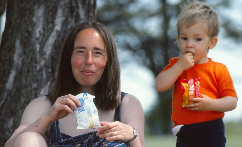
I took this during the picnic part of that same early expotition down to Netley in June 1982. (On an equally fabulous day, as it happens.)
I wonder how Brian's legs are this morning? :-)
Fine, he's just told me.
Will this, I wonder, be the day I finally tidy up / declutter the floor of my living room?
Downhill racers
Towards the foot of a steep hill:

The sky was blue...

The flowers were bright...

And the fish was basking...

All yesterday's photos courtesy of Mike.
Thanks, Mr Postie
Another £25 dollop from Mr ERNIE. Every little helps.
I remarked2 on the trickiness of memory. Last Monday I was mildly shocked to hear Lauren Laverne remind me that the single "Psycho Killer" from the unimaginatively named début album in 1977 by Talking Heads...

... was, as it were, as old as it was. That was nothing to the shock I felt when I quickly discovered I didn't have that album in my collection in any format (cassette, minidisc, CD, MP3, papyrus). I would have been prepared to bet I did (and, of course, I do now). I've just been listening to it while preparing scans of the video deliveries:

- Adventureland
Directed by the chap who made "The Daytrippers" - Last Action Hero
A user review on IMDB says (and I quote carefully) "Too intellegent for it's target audience". Clean up the spelling and grammar and I'd have to agree! - Zombieland
Looks very promising indeed - Genova
Michael Winterbottom makes interesting stuff; Colin Firth rarely disappoints
Here's hoping the elderly prawns in my lunchtime salad don't kill me. It's 13:23 and looking very nice out there.
Hint, hint
I realise few people share my interest in fonts, but when it comes to getting them clearly on to low-resolution display screens, this website offers some fascinating insights. Source and snippet:
Is it the "font smoothing" that makes text "smooth" but "blurry" or is it the "font-hinting" that makes text "sharp" but "hammered" into pixel boundaries? Why does sub-pixel rendering (aka ClearType) look more pixilated in Windows than sub-pixel rendering (aka Quartz) on a Mac? Or sometimes, anyway? Does "hinting" put "clear" into ClearType or does "hinting" compromise font design? What does "hinted for ClearType" mean, in the first place?
Shot of the day (revisited)
Some while ago, I remarked that my 2,746th picture on the Canon was one I was quite pleased with. (It showed a dragonfly.) Today's tulip (#4,699) is certainly more colourful. Click the pic for a bigger image: